


Hello there, I would like to walk you through the process of building a basic to-do list in react-native. Before I begin, here is a snippet of what we will be building in this article.
You should have a basic knowledge of React and how it works before engaging this article, as I would not be explaining some of these basic concepts
Getting Started We would start by using Expo to create or initialize a new app from the command line. This app is created by Expo and a boilerplate on which we will be building our to-do app.
$ expo init todo-list

$ cd todo-list

$ expo start
In the code above, an app called todo-list is created, then we change the directory to the todo-list folder that was created and start the app with the 'expo start' command. Go now to the App.js file and delete all the code there. Don't worry, we will write our own code, which is much better than what is already there. Now we have set up our environment, we can begin building.
Are you ready bud?
Sure you are.
Creating Components
Let's begin by creating a folder called Components, which will hold four files. These files are components that are serving different purposes. We will call these components AddInput.js, Header.js, Empty.js, and TodoList.js. These components will be the main attributes of our work here.
In AddInput.js we should have something like this:
//AddInput.js

import React, { useState } from "react";
import {View, TextInput, Text, TouchableOpacity} from 'react-native'


export default function AddInput() {
  const [value, setValue] = useState("");

  const onChangeText = (text) => {
    setValue(text);
  };

  return (
    <View>
      <View>
        <TextInput placeholder="Add Task..." onChangeText=
         {onChangeText} />
      </View>
      <TouchableOpacity
        onPress={() => {
          alert('button clicked')
        }}
      >
        <Text>Submit</Text>
      </TouchableOpacity>
    </View>
  );
}
This gives us a basic form where we write to-do items and a button to add them to the to-do list. Let's give this guy a bit of styling to make it look good.
styling AddInput.js We would be using a library called styled-components to style the component. Firstly, we install styled-components
yarn add styled-components
After installing it, we import it into the AddInput.js file so we can be able to use it.
//AddInput.js
 ...
import styled from "styled-components";

 ...

//beneath the AddInput component
//styles
const ComponentContainer = styled.View`
  flex-direction: row;
`;

const InputContainer = styled.View`
  flex-direction: row;
  border-radius: 10px;
`;

const Input = styled.TextInput`
  font-size: 20px;
  background-color: white;
  width: 300px;
  margin-right: 20px;
  padding: 10px;
  margin-bottom: 20px;
  border-radius: 10px;
`;

const SubmitButton = styled.TouchableOpacity`
  width: 50px;
  justify-content: center;
  align-items: center;
  background-color: whitesmoke;
  margin-bottom: 20px;
  border-radius: 50px;
`;

 ...
In the AddInput component, we would now be updating the native components to custom semantics from styled-components. These native components will now be accessed via styled-components. This is to enable the styling to take place in the AddInput component.
 ...

export default function AddInput(}) {
 ...
  return (
    <ComponentContainer>
      <InputContainer>
        <Input placeholder="Add Task..." onChangeText={onChangeText} />
      </InputContainer>
      <SubmitButton
        onPress={() => {
           alert('button clicked')
        }}
      >
        <Text>Submit</Text>
      </SubmitButton>
    </ComponentContainer>
  );
}

//beneath the AddInput component
//styles

 ...
As you can see, we updated the native components to a custom-styled component. In this case, we would not need to import these native components from react-native anymore as styled-components already let us access them.
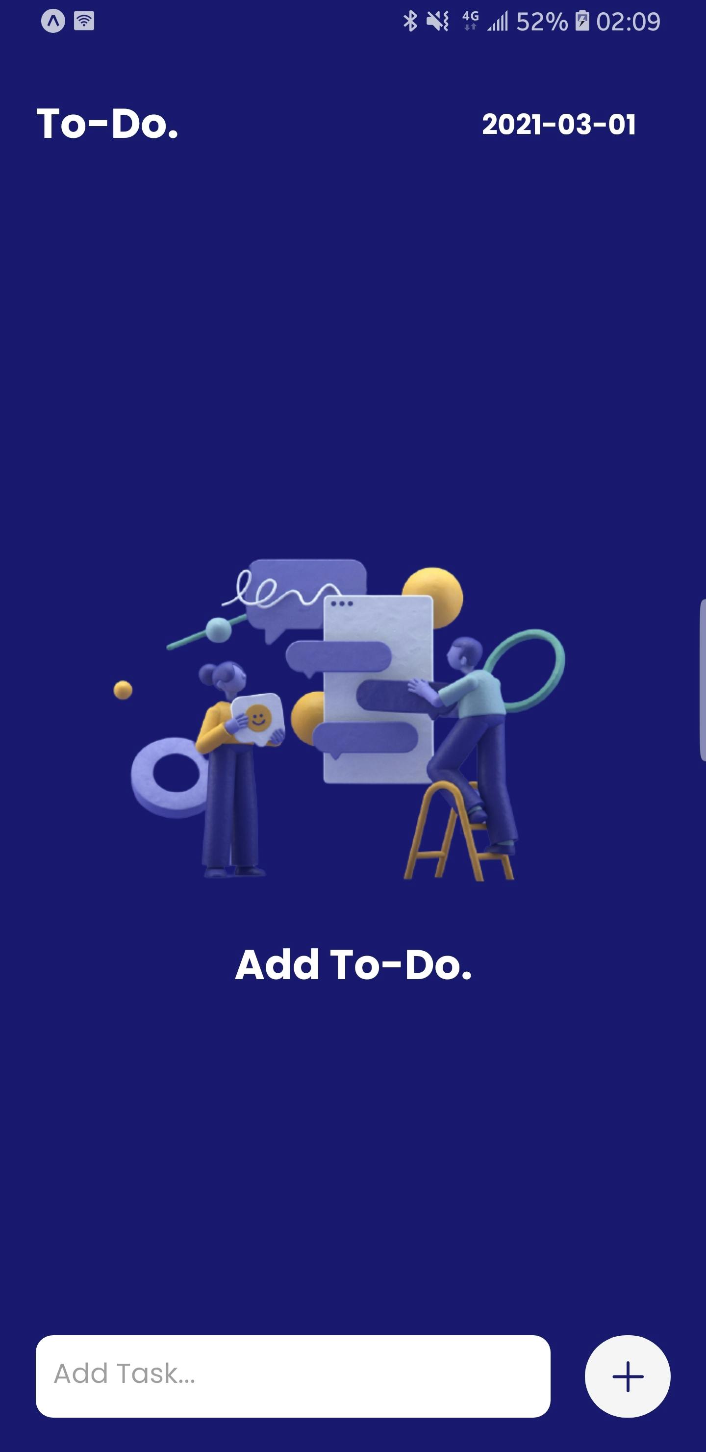
Alright, that's enough for the AddInput.js for now. Let's quickly build up the Empty.js before we continue. The Empty.js file is rendered when the to-do list is empty. This component kind of makes the app look more appealing.
import React from "react";
import styled from "styled-components";

export default function Empty() {
  return (
    <ComponentContainer>
      <EmptyImage
        source={require("add an image here")}
      />
      <EmptyText>Add To-Do.</EmptyText>
    </ComponentContainer>
  );
}

const ComponentContainer = styled.View`
  align-items: center;
  justify-content: center;
  height: 650px;
`;

const EmptyImage = styled.Image`
  width: 350px;
  height: 200px;
`;

const EmptyText = styled.Text`
  color: white;
  font-family: poppins-bold;
  margin-top: 30px;
  font-size: 30px;
`;
Let's build what I consider the heartbeat of this app. This will happen in App.js
import React, { useState } from "react";
import { View, StatusBar, FlatList } from "react-native";
import styled from "styled-components";


export default function App() {
 const [data, setData] = useState([]);
 return (
      <ComponentContainer>
        <View>
          <StatusBar barStyle="light-content"
             backgroundColor="midnightblue" />
        </View>

        <View>
          <FlatList
            data={data}
           renderItem={({ item }) => (
              console.log(item)
            )}
          />

        </View>
      </ComponentContainer>
    );
}

const ComponentContainer = styled.View`
  background-color: midnightblue;
  height: 100%;
  flex-direction: column;
  align-items: center;
  justify-content: center;
`;
FlatList
At this point, I want to let you know that a to-do list is an array. Let me explain that with something called FlatList. FlatList is a component used to display large scrollable lists. Lists displayed with the FlatList can be infinite and unpredictable. FlatList has two major props which include data and the renderItem. data takes an array, in this case, an array called data which is an empty array and depends on the AddInput component for data to fill up the empty array. This array is the to-do list. On the other hand, we have the renderItem which is a callback function that renders each item of the array of the data prop.
##Adding item to the list##
Let us go back to our AddInput component and look at one of the native components called TouchableOpacity. This component takes in a prop called onPress. If you check out our above code on AddInput.js, you will see that the onPress prop is set to alert('hi') . onPress runs a function when a button is pressed. Now, the function it will be running is the one that will be adding items to the list(array called data).
In App.js we will create a method called SubmitHandler, which adds each item to the list. This is the function that will be passed into onPress.
//App.js
  ...

export default function App() {
     ...
  const submitHandler = (value) => {
    setData((prevTodo) => {
      return [
        {
          value: value,
          key: Math.random().toString(),
        },
        ...prevTodo,
      ];
    });

     ...
  };
The submitHandler method holds a function called setData that updates the state by adding items to the array.
To get the SubmitHandler method to work in the AddInput.js, we need to bring the AddInput component into the App.js and pass the SubmitHandler as a prop to the AddInput component.
//App.js
 ...
import AddInput from "./Components/AddInput";

export default function App() {
   ...

  const submitHandler = (value) => {
    setData((prevTodo) => {
      return [
        {
          value: value,
          key: Math.random().toString(),
        },
        ...prevTodo,
      ];
    });
  };


    return (
      <ComponentContainer>
        <View>
          <StatusBar barStyle="light-content"
            backgroundColor="midnightblue" />
        </View>

        <View>
          //FlatList
          <View>
            <AddInput submitHandler={submitHandler} />
          </View>
        </View>
      </ComponentContainer>
    );
The submitHandler method is passed in as a prop to the AddInput component to be used inside the AddInput component.
Back to AddInput.js, we pass in the props
  ...
export default function AddInput({ submitHandler }){
   ...
return(
  ...
 <SubmitButton
        onPress={() => {
          setValue(submitHandler(value));
        }}
      >
        ...
      </SubmitButton>
)
}
Here, we are adding the value from our form input to the array being handled by the data prop in App.js with the help of onPress who calls the SubmitHandler function when pressed.
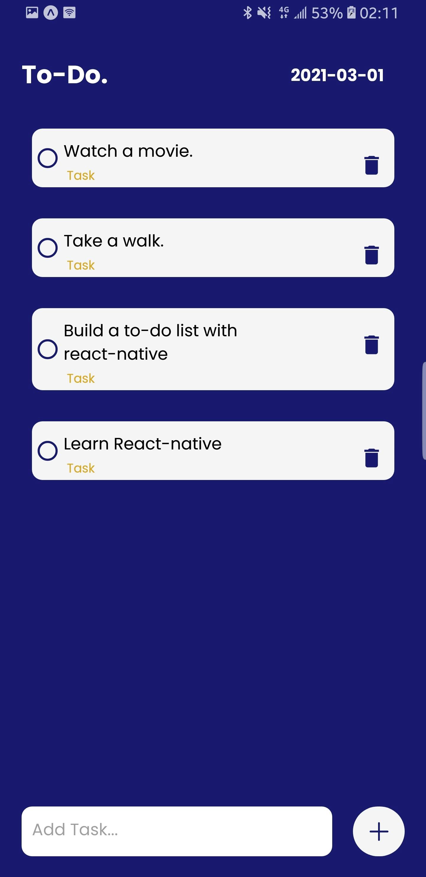
Displaying list to screen
Another component called TodoList is created at this point because we need it to render our to-do list items to the screen. Remember the renderItems prop from FlatList which helps to render items from the data prop to the screen? We are going to use it to render the TodoList component to the screen(this component holds our array items.)
Back to App.js
  ...
import TodoList from "./Components/TodoList";
  ...

<FlatList
            data={data}
            renderItem={({ item }) => (
              <TodoList item={item} />
            )}
          />
Now moving to the TodoList.js, we build our component.
//TodoList.js
import React from "react";
import { View } from "react-native";
import styled from "styled-components";

export default function TodoList({ item }) {
  return (
    <ComponentContainer>
      <ListContainer>
        <View>
          <TextItem>{item.value}</TextItem>
          <TextTask> Task</TextTask>
        </View>
      </ListContainer>
    </ComponentContainer>
  );
}

const ListContainer = styled.TouchableOpacity`
  background-color: whitesmoke;
  height: auto;
  width: 350px;
  margin-bottom: 30px;
  border-radius: 10px;
  flex-direction: row;
  justify-content: space-between;
`;

const ComponentContainer = styled.View`
  flex-direction: row;
  justify-content: center;
  height: auto;
  width: auto;
`;

const TextItem = styled.Text`
  color: black;
  width: 260px;
  height: auto;
  font-size: 20px;
  margin-top: 10px;
  margin-right: 20px;
  font-family: poppins-regular;
`;

const TextTask = styled.Text`
  color: goldenrod;
  font-size: 15px;
  margin-right: 20px;
  font-family: poppins-regular;
  border-radius: 10px;
  width: 40px;
`;
At this point, each item of our to-do list should be displayed on the screen when the function in onPress is called.
Before we continue, we need to make our list of items unique with a key. We do this by employing a prop called the keyExtractor prop in FlatList. This prop assigns a key to each of the items in the list.
  ...

<FlatList
            data={data}
            keyExtractor={(item) => item.key}
            renderItem={({ item }) => (
              <TodoList item={item} />
            )}
          />
Deleting items from list
To delete items from the to-do list, we will create a method called DeleteItem in App.js and bring it in as a prop into TodoList.js
//App.js
  ...

export default function App() {
     ...
  const deleteItem = (key) => {
    setData((prevTodo) => {
      return prevTodo.filter((todo) => todo.key != key);
    });
  };
     ...
  };
Now we pass deleteItem as a prop to the TodoList component
//App.js
  ...
import TodoList from "./Components/TodoList";
  ...

<FlatList
            data={data}
            keyExtractor={(item) => item.key}
            renderItem={({ item }) => (
              <TodoList item={item} deleteItem={deleteItem} />
            )}
          />
For DeleteItem to work in TodoList.js, we need to update the component.
import React from "react";
import { View } from "react-native";
import { Entypo } from "@expo/vector-icons";
import { MaterialIcons } from "@expo/vector-icons";
import styled from "styled-components";

export default function TodoList({ item, deleteItem }) {
  return (
    <ComponentContainer>
      <ListContainer>
        <CirlceContainer>
          <Entypo name="circle" size={20} color="midnightblue" />
        </CirlceContainer>
        <View>
          <TextItem>{item.value}</TextItem>
          <TextDate> Task</TextDate>
        </View>
        <IconContainer onPress={() => deleteItem(item.key)}>
          <MaterialIcons name="delete" size={24} color="midnightblue" />
        </IconContainer>
      </ListContainer>
    </ComponentContainer>
  );
}

const ListContainer = styled.TouchableOpacity`
  background-color: whitesmoke;
  height: auto;
  width: 350px;
  margin-bottom: 30px;
  border-radius: 10px;
  flex-direction: row;
  justify-content: space-between;
`;

const ComponentContainer = styled.View`
  flex-direction: row;
  justify-content: center;
  height: auto;
  width: auto;
`;

const TextItem = styled.Text`
  color: black;
  width: 260px;
  height: auto;
  font-size: 20px;
  margin-top: 10px;
  margin-right: 20px;
  font-family: poppins-regular;
`;

const TextDate = styled.Text`
  color: goldenrod;
  font-size: 15px;
  margin-right: 20px;

  font-family: poppins-regular;
  border-radius: 10px;
  width: 40px;
`;

const IconContainer = styled.TouchableOpacity`
  align-items: center;
  justify-content: center;
  margin-right: 10px;
  margin-top: 15px;

  height: 40px;

  border-radius: 10px;
`;

const CirlceContainer = styled.View`
  align-items: center;
  justify-content: center;
  padding-left: 5px;
`;
In the above code, we can delete an item from the list and we use icons to represent the delete button which removes items from the list when pressed.
Final Touches
The FlatList has other props attached to it. but we would focus on two more. These three include: a. ListHeaderComponent b. ListEmptyComponent
ListHeaderComponent will hold a component that contains the header of the list. Remember our Header.js file? It is time to use it.
//Header.js

import React from "react";
import styled from "styled-components";

let today = new Date().toISOString().slice(0, 10);

export default function Header() {
  return (
    <ComponentContainer>
      <HeaderText>To-Do.</HeaderText>
      <HeaderList>{today}</HeaderList>
    </ComponentContainer>
  );
}

const ComponentContainer = styled.View`
  height: 100px;
  flex-direction: row;
  justify-content: space-between;
  align-items: center;
`;

const HeaderText = styled.Text`
  color: white;
  font-family: poppins-bold;
  font-size: 30px;
`;

const HeaderList = styled.Text`
  color: white;
  font-family: poppins-bold;
  font-size: 20px;
  margin-right: 20px;
`;
This component will be at the head of the screen. Let's make some changes to our App.js file.
//App.js
  ...
import Header from "./Components/Header";
  ...

<FlatList
            data={data}
            ListHeaderComponent={() => <Header />}
            keyExtractor={(item) => item.key}
            renderItem={({ item }) => (
              <TodoList item={item} deleteItem={deleteItem} />
            )}
          />
Another prop is the ListEmptyComponent which renders a component when the to-do list is empty. Here, we are going to pass in the Empty component from Empty.js
//App.js
  ...
import Empty from "./Components/Empty";
  ...

<FlatList
            data={data}
            ListHeaderComponent={() => <Header />}
            ListEmptyComponent={() => <Empty />}
            keyExtractor={(item) => item.key}
            renderItem={({ item }) => (
              <TodoList item={item} deleteItem={deleteItem} />
            )}
          />
Conclusion
Pheew! That was a lot of code. I hope you practice this and get your hands dirty. It is the best form of learning. I would love to see you tweak the code to your own taste and make something nice out of it. Good Luck in your endeavors and React-Native journey.